Tactile Design
Guess what this is before reading on!
And who is it for? The markings on the bottom might give it away. It’s a ski map for blind and visually impaired skiers! In this article, I’ll explain why and how it was made.
Background
A ski instructor friend of mine approached me with the idea of creating a map of the Präbichl (Austria) ski resort after he saw my map of Gerlach. It wasn’t supposed to be just an ordinary map though, it was for a group of blind and visually impaired skiers they take there every year.
Wait, blind skiers?!
Yep! How does that work? Each blind skier is accompanied with a guide that skis in close proximity and steers them through the slopes. Some use a radio for easier communication, some just shout.
Here’s a video: https://youtu.be/UEOuJWxo7TQ
Why would the blind need a map? Well they don’t need one, but – as you’ll see shortly – it’s a fun way to understand where they are (or more likely were) and how slopes run, where lifts go and what else is there around them.
Objectives
The point is not to be accurate, but to be useful. The map needs to include what matters for this particular group. So their apartment building is there while the rest of the village isn’t. Ratios are somewhat distorted to be able to include the important things. The slopes, lifts and the shape of the mountains are as accurate as possible.
Since this map will be handled by folks whose main way of interaction is touch, it needs to be a pleasant tactile experience. No sharp corners and edges! The textures need to be fine and have distinct meanings. The different difficulties of slopes – which are conveyed by color on a regular ski map – will have different textures.
Elevation data
How do we get the accurate shape of the mountains? We’ll copy the real ones!
Luckily there’s a lot of publicly available geographical data from Europe due to different EU initiatives. Sometimes even too much. When researching for this post, it took me nearly an hour to find what I’ve already found a few months back.
In this dataset, Austria is divided into 50 km by 50 km tiles. There’s a PDF with an overview map, but even with that it’s not trivial to pinpoint which one Präbichl falls into as it’s close to the border between two.
The overview map refers to the tiles by their EPSG:3035 coordinates though. So if one can
find the EPSG:3035 coordinates of the resort, it’s easy to get the right one.
Here’s a website (epsg.io) that helps with coordinate conversion.
After waiting for the two-hour download (12 GB), we’re left with a GeoTIFF file. It’s a grayscale image, where the color encodes the height and every pixel has a coordinate associated with it. Here’s what the area of the resort looks like:

And this is a mountain. Imagine how boring plains look!
I’ve used QGIS and Gimp to extract the relevant section and convert it to a regular image with enough precision. There are other, closed-source and paid, options though!
Elevation to 3D mesh
Turning that grayscale image into a 3D mesh is very easy with Blender. We just need a plane, subdivide it a couple of times to have enough detail and apply the image as a Displacement texture. It only takes 12 seconds – if you’re good with video editing:
If we export the same section of OpenStreetMap from QGIS and apply it as a texture, it starts to look like a proper map:
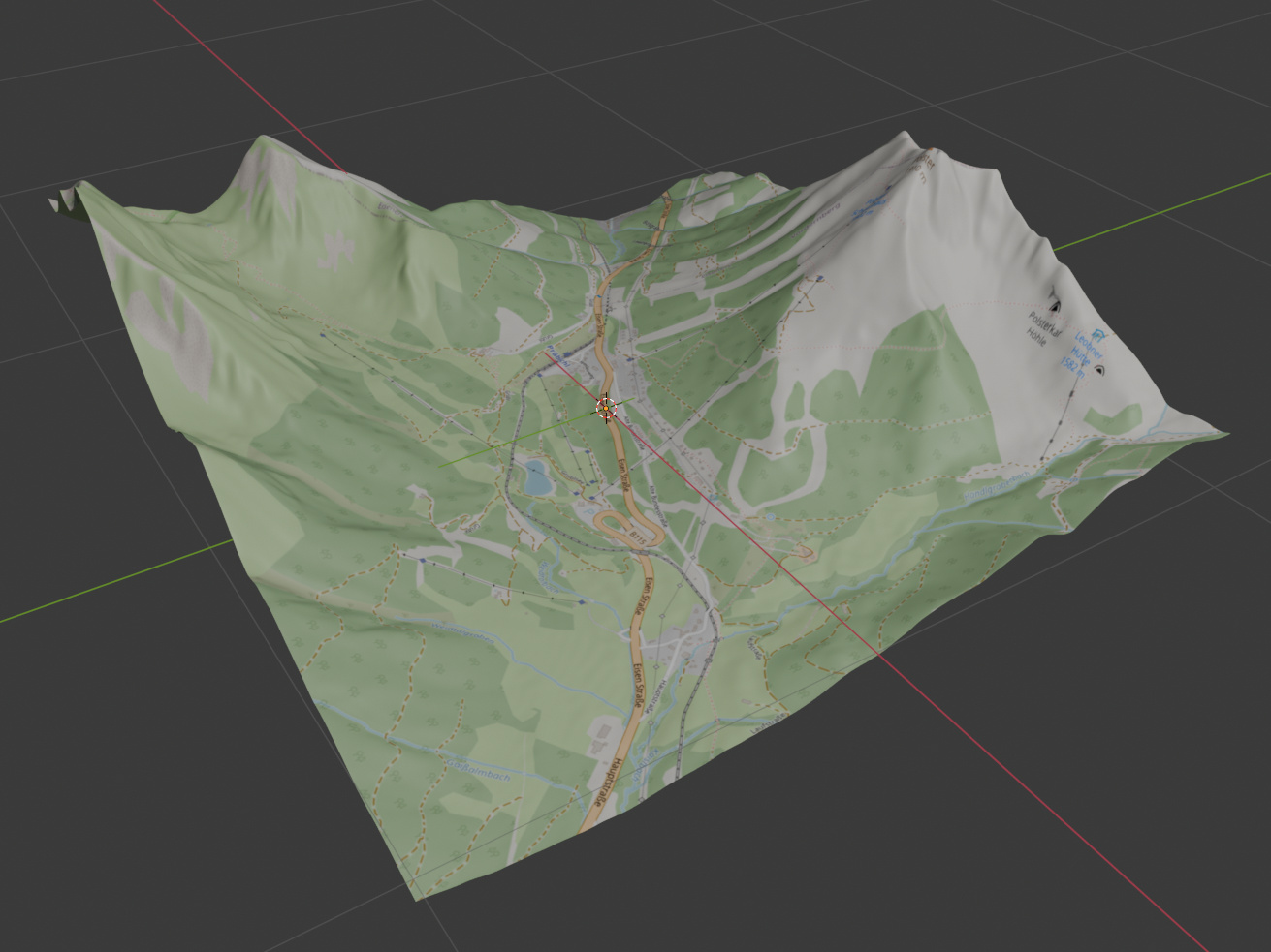
But we’re not going for looks here, we’ll need to add all the details as 3D artifacts.
Slopes
The most important assets of a regular ski map are the slopes. The same is true for our map. We wanted the slopes to be as accurate as possible while being easy to follow with your fingers.
How do we know where the slopes are? That’s a tough question as regular ski maps are quite relaxed on how they portray them. Crossroads and some landmarks need to be accurate, but they’re quite distorted otherwise to fit as much on the map as possible. Luckily Präbichl is a relatively small resort, so their map is not that distorted:
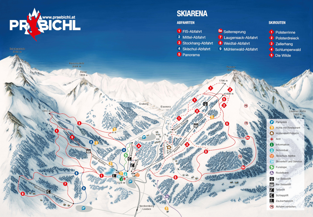
(From praebichl.at)
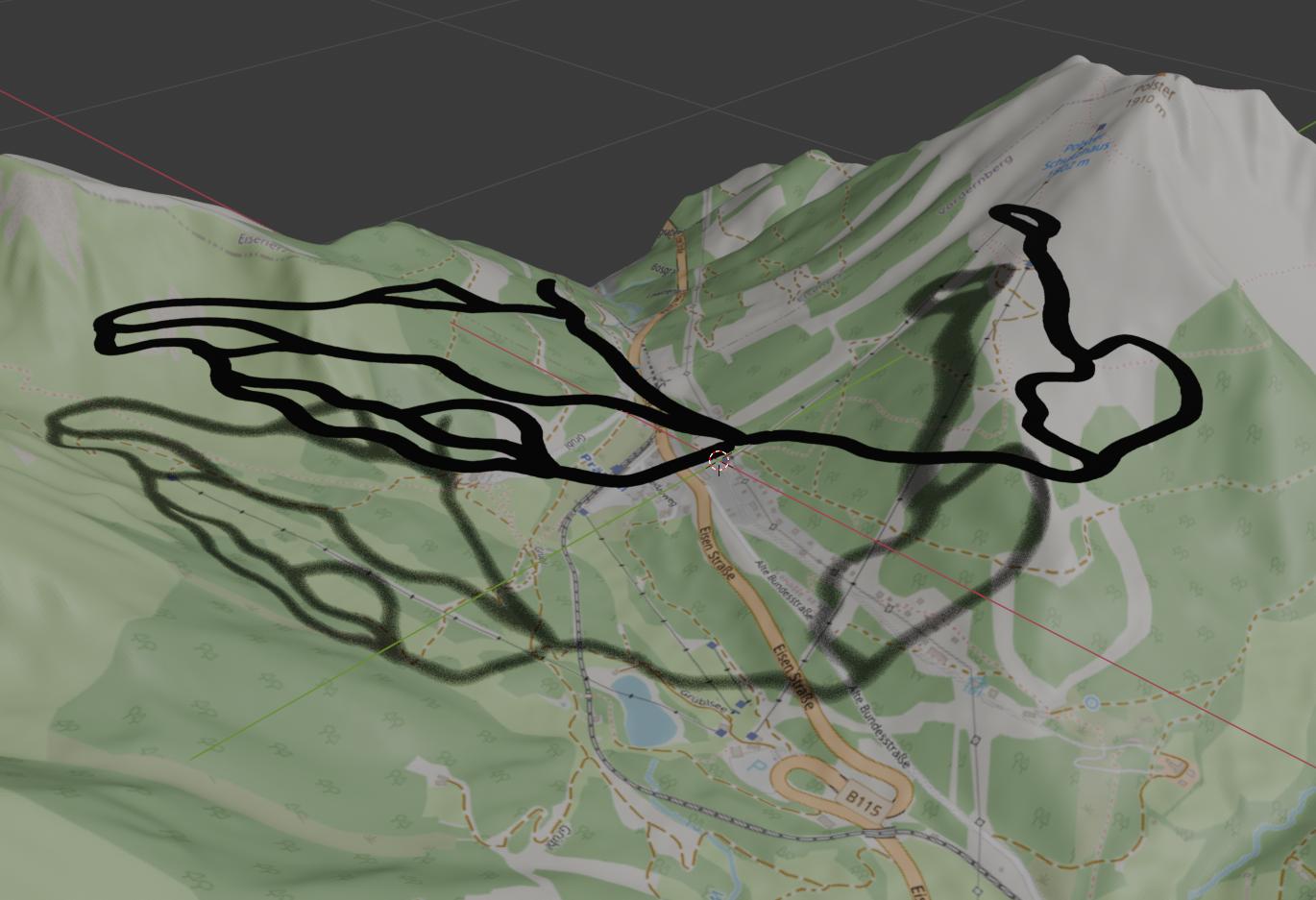
After some consultation on which slopes are of interest, I drew them as vector paths in Inkscape over the OpenStreetMap base map:
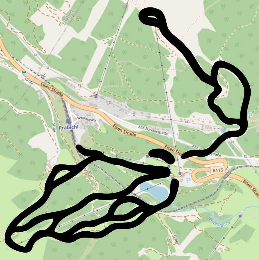
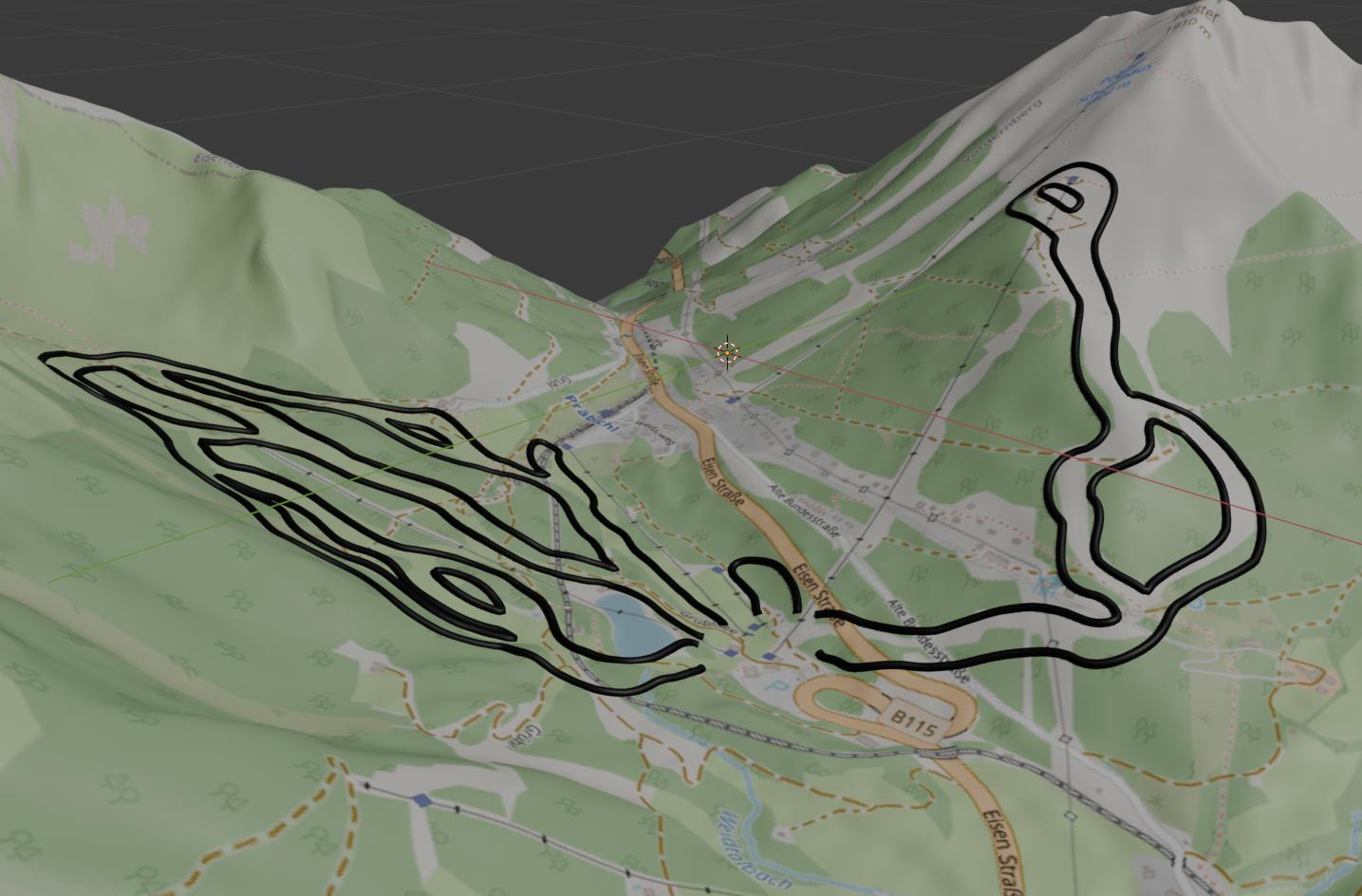
This SVG vector image can be imported in Blender. It will look exactly the same from the top, but a glimpse from the side reveals there’s more work to do:
We want to keep only the sides of the slopes as thin tubes and they need to be projected onto the terrain. The following Blender Geometry Nodes setup will achieve exactly this (and a little more by resampling the curve to increase its resolution for better accuracy):
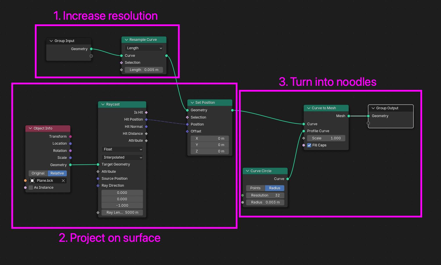
This use-case of turning curves to noodles is so common that while I was working on this, Blender 5.0 came out with a Curve to Tube modifier which does exactly this (and more, including rounded caps).
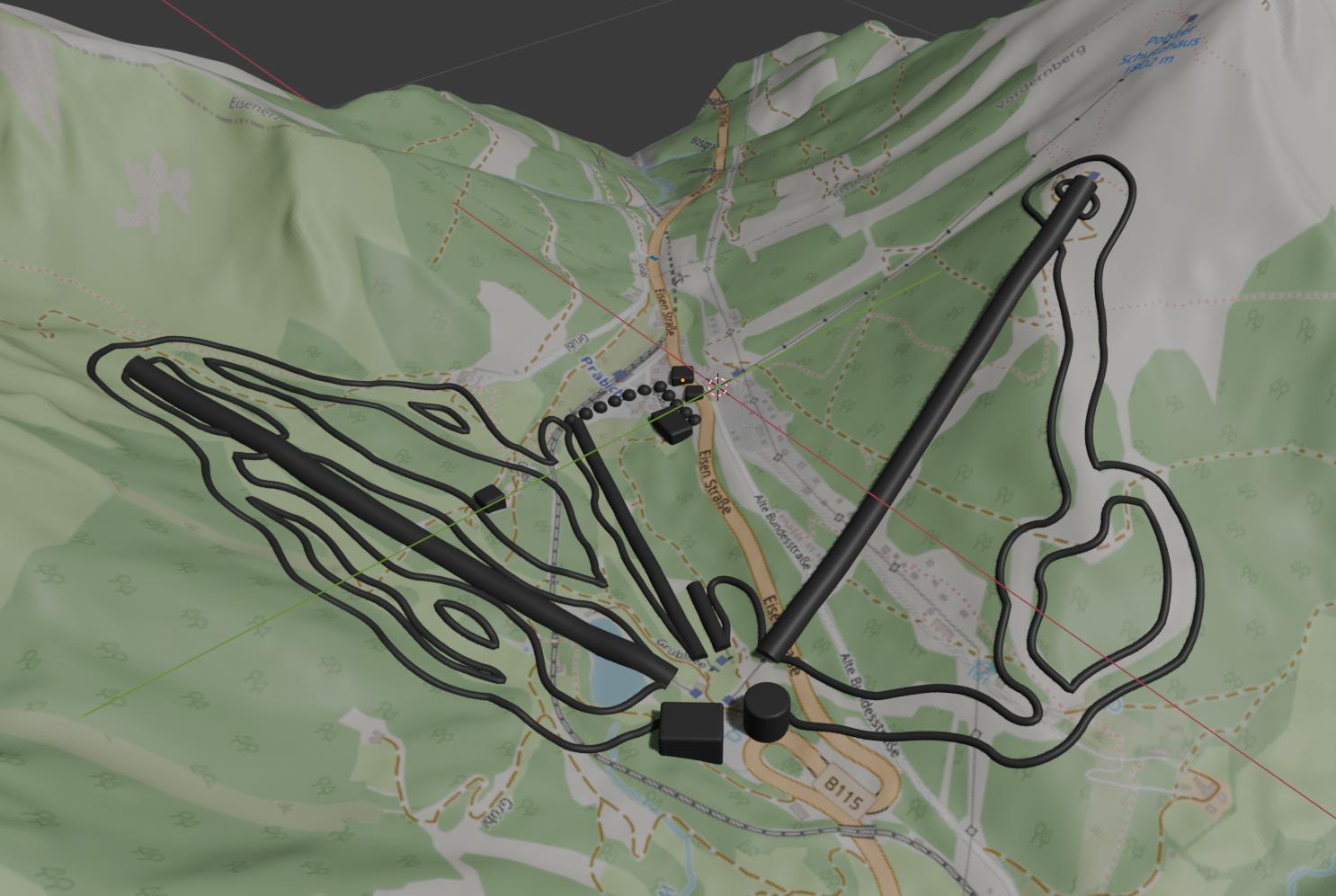
After manually adjusting the curves in Blender to make the slopes wider and cutting them open at their bottom end, they look something like this:
Lifts and other landmarks
Lifts were created similarly to slopes, they are straight noodles projected on the terrain with different diameters, based on the lift type (chair lifts are bigger). We’ve added a few buildings of interest, including their apartment building and the walking path that leads from there to the slopes (see dotted path in the middle):
I wish to say I was smart enough to round down all corners before printing, but at least I did it for the image above! In reality some of the buildings were subject to a bit of post-processing with a nail file.
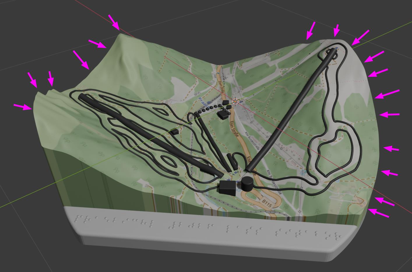
Final shape
At this point, our map is just a distorted plane floating in space with some noodles and cubes sprinkled on top. To 3D print this, we extract a circular shape, extrude it to give it depth and add a small base with a Braille title (“Präbichl 2026 LÁSS Ski”).
I did a test print with this and it was all great with the exception of the sharp edges where the mountains end. These were really not pleasant to touch:
It occurred to me early on in the process that these might end up causing trouble. I really hoped they wouldn’t though as rounding off edges with fine details around them (like this terrain) is traditionally not an easy feat. Here’s what happens when you try to bevel the edge:
The new faces that beveling creates overlap with existing geometry and even extend outside of the object around the “corners”.
Luckily – after some sleepless nights – it occurred to me that we can use the fine details to our advantage here. To bevel this (more or less horizontal) edge, we can move it “down” with Proportional Editing enabled so nearby vertices will follow. It’s not perfect, especially around the more vertical parts, but it’s more than enough for the scale we’re about to print this in:
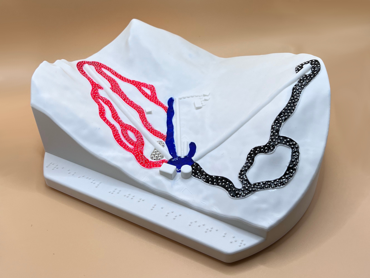
After some final touches, like cutting out a lake, we’re left with the following object that we can 3D print (in a single color):
Slope textures
To indicate the three different difficulties of the slopes, we wanted them to have different textures with the finest meaning the easiest and the roughest the hardest. We probably could have done this via 3D printing, but luckily my wife had the amazing idea of applying gel nail polish with embedded beads of different sizes.
We’ve experimented with different versions on a test piece and ended up doing the last three from here:
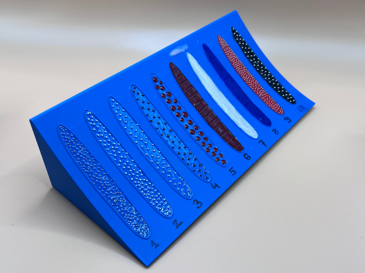
For the red and black slopes this meant applying 6 layers (base, color, color, base, beads, top coat) and drying each with a UV lamp. Here’s a close-up with all three visible:
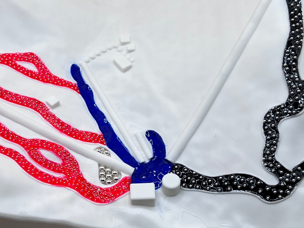
You can even see how beads were used to mark a lake on the map.
Result and reception
After 11 hours of 3D printing, many hours of applying nail polish, here it is, a ski map for blind and visually impaired skiers:
We’ve made two copies and my friend took them on their trip this year. Here’s how everyone tried to guess what it is. Did you figure it out more quickly?